

This article will help you select the right fonts for your law firm.
Learn how to choose fonts for your website, landing page, articles, documents, business cards, social media, and logo.
We wrote this guide specifically for lawyers which supposedly have little knowledge about fonts, but also people with more info in this subject can benefit from this quick read.
So, let’s start with a popular question.
How are fonts impacting the world – website, landing page, documents, etc.?
Clothes represent us, so do fonts represent our work.
So, for example, if you write an article about your law firm and you use a font that is hard to read, people might not read it completely.
Even worse, you might choose a font that is not appropriate for the subject and feel of the article.
How would this font look on your article?
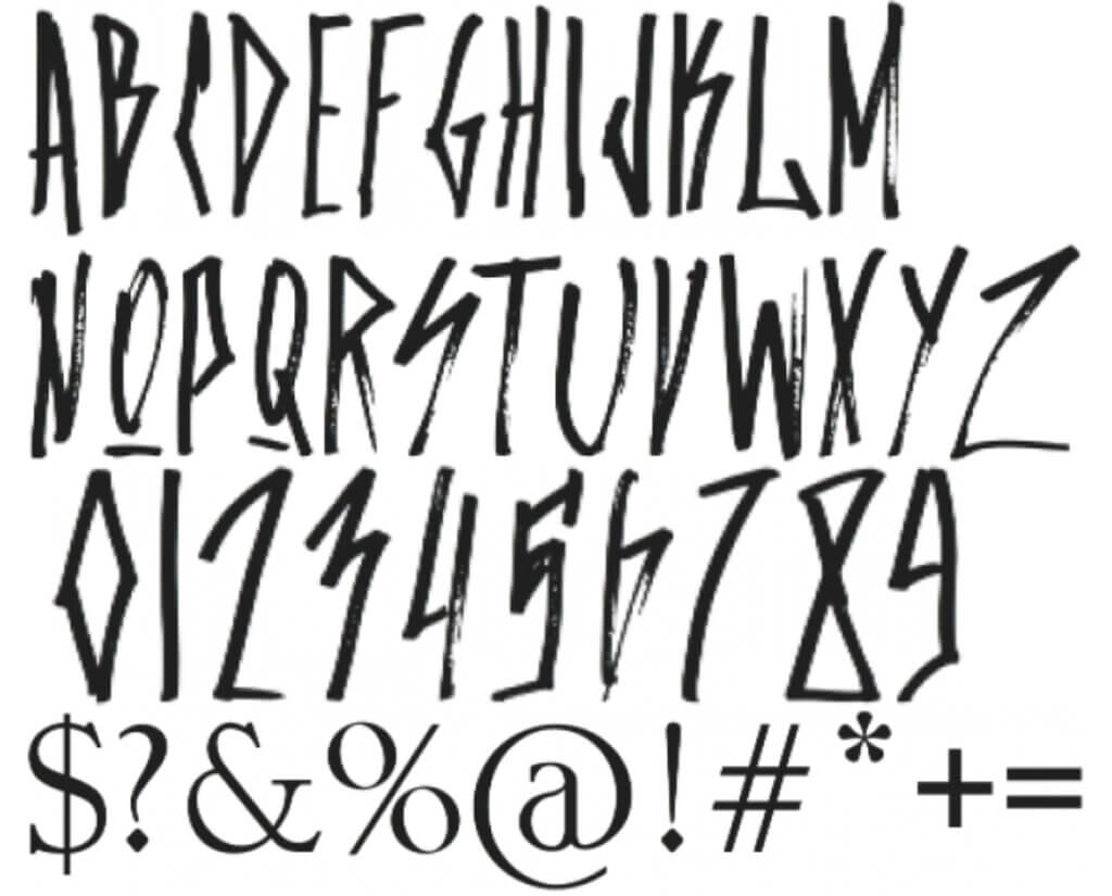
This font is a calligraphic font that is premium (price $12) and which is a nice font if you are using it correctly.
But you cannot and you should not use it on an article for a law firm.
Fonts are highly important and you should always pick the right fonts for your law firm.
Here is now.
Select the right fonts for your law firm
What I suggest is to keep the font selection simple.
To choose fonts for your law firm, you don’t need to hire graphic designers, web designers, or marketers, and you don’t need to read books about fonts.
It is not that all those people are not super helpful or that the books are bad, but if you have a law firm, you should spend time on doing the work you are supposed to do.
Don’t get lost choosing fonts, building the website, picking the right logo, and so on.
Things can overcomplicate is seconds, so just don’t it.
Let’s get back to font selection.
To pick the right fonts for your law firm, just stick with the following common-sense ideas.
The fastest way to pick the right fonts for your law firm, is to stick with the standard, most popular fonts – Arial, Times New Roman, Calibri, Roboto, etc.
You cannot go wrong with any of these fonts, but your documents, websites, etc., will look exactly the same as all the other law firms.
This is not bad, but it isn’t good.
Free or paid fonts
Don’t think a free font is bad or worse than a paid font.
Used correctly, all fonts (almost all fonts) are great.
If you have some money to spare, you can look also at paid fonts.
Prices are affordable; you can find plenty of premium fonts for $10 or under.
Sans serif or serif fonts
This is the difference.
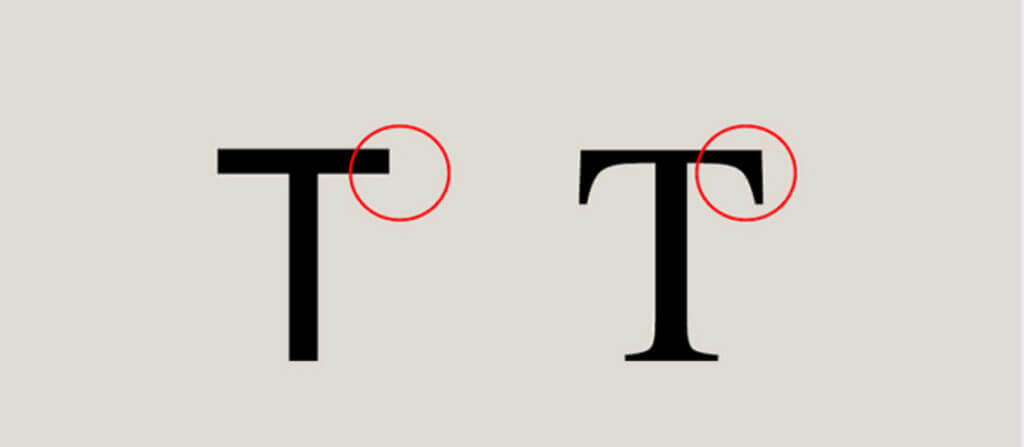
First T is sans-serif, and the second T is a serif.
Usually, Serif fonts are easier and faster to read, but it also depends on which serif font you are looking.
Some sans-serif fonts might be easier to read than serif fonts.
I would not complicate font selection with this, pick a font that looks nice and it is easy to read.
Easy to read
The most important thing when choosing fonts is to pick one that is easy to read.
You want your customers and blog audience to easily read what you write.
Use policy
Be careful to read the font use policy.
There are free fonts that are free to use just in personal projects.
1-2 maximum fonts
After you choose 1-2 fonts for your law firm (one font for headers, and one for paragraphs), stick with them everywhere – website, documents, on your logo if possible, landing pages, articles, etc.
You want to be consistent.
Test
Don’t rush the font selection process and do some tests.
Is your font looking great, representative for your law firm?
Here is a tip, whenever you find a font that you like, search it on Google and make sure that your font is not ranked as the most hated fonts ever created – like Comic Sans ugly font for example.
Conclusions
Choosing fonts is not complicate, you can simply stick with the fonts you get from the website builder you use, or from the word processor software, and you are good to go.
If you choose to have a different font, selection is not complicated.
Just stick with the above ideas and you will be safe.